Now isn’t this the open-plan kitchen-diner of dreams? You’re simply spoilt for choice as to where you can sit; the island, the bench seating, the sofa, or the formal dining table. An added bonus? You can talk to the chef no matter which one you choose – which means it’s perfect for throwing dinner parties and entertaining.
When Tizzy and Andy Cox saw this Haslemere home, built in 2009, the three-storey detached house was was badly designed but it had great potential.
The footprint of the property was long and thin, and it was split into small rooms. It’s hard to imagine now, but the kitchen was very small, with little storage.
You couldn’t even open one of the cupboard doors without hitting the oven. So the pair decided it would be better to open it all up into one large space.


The couple built an extension on one side of the house to create an improved utility and a boot room before they tackled the main ground-floor, which would become an open-plan kitchen-diner and living space.
For the works, new RSJs went in and under-floor heating was installed, while bi-fold doors were put in downstairs and new flooring laid throughout. Then it was time to think about the kitchen.
The pair went to Martin Moore for their scheme, and its designer Pam Baker helped with getting the layout just right.

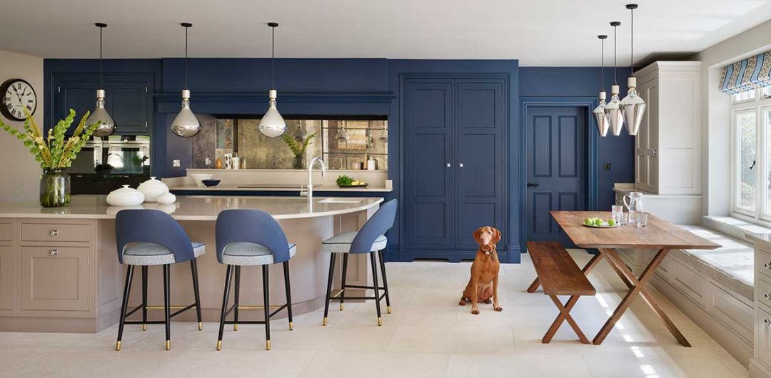
Pam suggested an L-shape layout with an island and tall units either side of a generous mantle. Providing enough storage was key to the brief, so every area was maximised, which also saw the inclusion of a larder, bar area and breakfast cupboard.
The couple had a range cooker in their old house, but chose an induction hob this time, which was placed at the back of the space. This meant they could have drawers beneath the appliance, for even more storage, with additional cupboards located below the built-in ovens, too. It’s very practical.


A real show-stopper is the curved breakfast bar – complete with lots more drawers and cupboards. Adding a rounded edge to the island gives an added interest to the design and also helps prevent the kitchen looking too boxy, plus it’s more comfortable for sitting at, particularly as it allows whoever is there to face the other easily.
Another benefit of the sizeable space was that the couple could include all the appliances they wanted. Tizzy chose Gaggenau fridges and freezers, as they had them in the old kitchen, and Siemens for the ovens.
But a real favourite is the warming drawer, which Tizzy loves to cook in and prove dough. A boilng-water tap was also a must – which she has a separate sink for.
There’s also a breakfast cupboard for smaller gadgets, plus a drinks unit in the formal dining area, which can be easily accessed from the living room.


With their storage and appliance boxes ticked, the final decision Tizzy and Andy had to make lay in the colour choices. She had seen a bold blue kitchen in a magazine, and thought as the room was a large, bright space, it could take it. And how right was she?
However, she didn’t want the whole kitchen in the same shade, so picked Elephant’s Breath from Farrow & Ball for the rest of the cabinetry and the walls to balance out the Carbon Blue by Fired Earth on the back wall, with Charleston Grey, also by Farrow & Ball on the island.
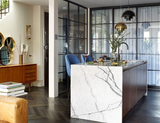
The screen between the kitchen and dining room was the last thing to go in and works well to divide up a very big space while still letting light flood through.
Can’t you just picture the scene? Tizzy is cooking, Andy at the kitchen table and their two boys and dog Alfie can be on the sofa. They’re all in the room but doing our own thing, but don’t feel that we are on top of each other.
Photography: Darren Chung | As originally told to: Alison Davidson


