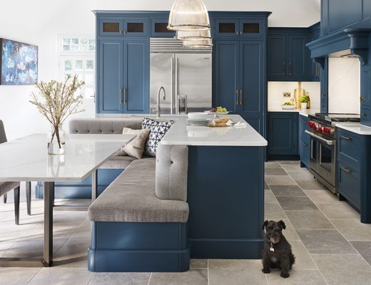
Looking to transform your kitchen into the perfect entertaining zone? We tour the Gill family’s contemporary redesign, which makes an inviting new hub for them and their friends…
Itching to gain more space in their 1930s-built home, Kiera Gill and her family began plotting an extension to their property. “As my husband and I planned on having a baby, we wanted a kitchen that would work as the heart of our home,” Kiera tells KBB journo Amelia Thorpe. “We’re sociable people, so it made sense to replace the small kitchen of before with a larger space with room for dining, entertaining and relaxing.”
The couple decided to extend across the rear and side of their semi-detached house, converting the loft at the same time, to dramatically increase its size.
“It was a major project,” recalls Kiera. “We did think about moving, but the house is in a quiet location surrounded by trees, with good links into London; it’d be difficult to find anywhere else as nice and convenient as here.”


The kitchen design
Once planning permission had been granted, Kiera contacted a few kitchen designers, including Shehryar Khan of Sheraton Interiors, giving each a similar brief. “Shehryar came back with a design most in line with the brief, with heaps of creativity added on top,” she says.
At the top of the wishlist was a large island, meant to form the social hub of the room, with a contemporary, streamlined look inspired by interior designer Kelly Hoppen. “Her work is timeless and I like her subtle colour palette and clean aesthetic,” says Kiera. “When I saw her book on a shelf in the Sheraton Interiors showroom, I knew we’d made the right decision – great minds think alike!”


By using the long wall of the room, a sweep of handleless cabinetry in a milky coffee shade houses built-in appliances and offers plenty of storage, broken up by a feature ‘letter box’ sink area. This helped accommodate the split-level island, complete with space for bar stools and linked to a family-size dining table, which takes up less space than a freestanding model.
“By positioning the hob on the island, the cook can interact with friends and family on the bar stools or sitting at the dining table,” says Shehryar.

The details
The split-level island is clad in a walnut finish to provide rich contrast to the wall cabinets and add warmth, picking up on the darker veins of the marble-effect, ultra-compact porcelain worktops and splashback. “Ages ago, I decided on marble and walnut,” says Kiera, “but it was difficult to choose the pattern from a small sample, so Shehryar sent us to Dekton’s showroom in London to see a full-size slab.”
To accentuate the Dekton surfaces, LED strips run around the side and top of the sink area. “The section of dropped ceiling also has built-in lighting, which casts a warm glow in the evening and highlights the island and table,” she adds.

Another social feature, the built-in bar has double doors that offer access to glass shelves, bottle racks and a counter for serving drinks, plus a wine cooler.

How does Kiera feel about the space? “When friends and family are here, everyone congregates around the island, which is just what we wanted,” she says. “It’s a multi-functional room designed for our growing family.”
As originally told to: Amelia Thorpe | Photography: Chris Snook
This house tour was featured in the November 2024 issue of Kitchens Bedrooms & Bathrooms magazine.


