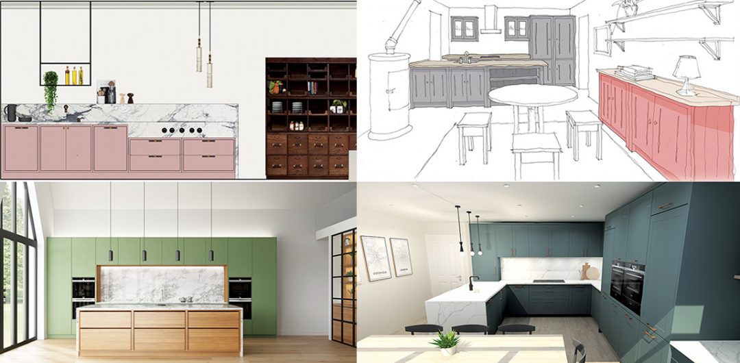
Kitchen layout ideas can be tricky. Do you have a kitchen layout in mind but aren’t sure it will work in your space? Or are you worried that you won’t get the most of out it? Here we challenge eight kitchen designers to show you just what’s possible with different types of kitchens, from L-shaped to a galley with an island.
Kitchen layout ideas are essential. There’s probably nothing more important when designing a new kitchen that getting the layout right. (And there are so many different types of kitchens, it can feel overwhelming!) If your space doesn’t work ergonomically, it’s going to make cooking and entertaining – and even simple day-to-day life – super-stressful.
So, where do you start with kitchen layout ideas? First of all, assess your space and look at your lifestyle – how much storage will you need? Are you a passionate cook who needs lots of worktop area? Do you love to entertain and want lots of seating? You can find out more information about all the different types of kitchen layout, and the pros and cons, here.
Once you have an idea of a layout in mind, there are still lots of things you can do to make it unique, practical and beautiful.
To show you what we mean, we challenged eight designers to come up with kitchen layout ideas. We gave them some of the most common types of kitchen layouts and design briefs. Each had a very similar brief and similar size room. You can either scroll below, or check out this video of me talking you through each design. Happy reading (or watching!).
The double galley kitchen layout
(Ideal for long, narrow rooms – and sometimes referred as just a galley – these have two runs of cabinetry placed parallel to each other.)
Option 1: By Neil Stafferton, design manager, British Standard by Plain English


So, in the first of our kitchen layout ideas, Neil has used a wide peninsula to create the double galley. This is perfect for dividing the cooking zone from the more informal dining area. However, sitting at the end of the run are the tall cupboards and fridge. These are handy for guests to get to drinks while not disturbing the chef in the cooking zone.
I love the informal cabinetry Neil’s included in the dining zone, perfect for adding more storage for crockery. I also adore the shelving he’s included on the peninsula – a nice decorative touch for things like cookbooks.
Option 2: Brooke Collins, interior designer, Day True


Here in the second of our kitchen layout ideas, we’ve got two long runs of cabinetry with lots of different things going on. (Don’t you love the green and pink, by the way?!) On one side, you’ve got the cooking run – including an extra-deep worktop with a wall-mounted tap and feature splash back. The hob area is defined by a dropped apron-style front in the marble worktop where the controls for the Bora hob are mounted.
Opposite, there’s a steel-glazed pantry, tall cabinets with ovens and built-in banquette seating with extra storage.
I love how the two different runs have very different looks and functions, but work so well together!
The L-shaped kitchen layout
(Known as one of the most efficient layouts, they have two adjacent runs of units. These can either be on two walls, or on one with a peninsula coming out into the centre of the room.)
Option 1: Al Bruce, founder of Olive & Barr


Voilà, the third of our kitchen layout ideas. For this L-shaped layout, Al has created a bold Shaker-style design with units on two walls and a split level island. The cabinetry goes right up close to the ceiling, making the most of the space available, with an integrated fridge-freezer.
On the adjacent side, there is a double stainless-steel sink and dishwasher, while a larder completes the run.
I love how the island has a downward draft hob, meaning the views to the garden aren’t ruined. It also has the adjoining dining table – perfect for social dinner parties.
Option 2: Tom Howley, design director of Tom Howley


Another striking green kitchen in the fourth of our kitchen layout ideas! So, what Tom has created is an L-shaped design that is filled with storage. The island provides ample worktop space and seating for three people. The floor-to-ceiling cabinets include a pantry and a breakfast cupboard (with even more worktop space if needed).
I love the drawers and storage by the hob and ovens, perfect for accessing pots and pans while cooking.
The galley and island layout
(Fantastic if you want the island to be the main focal point within the space.)
Option 1: By Jack Crisell, designer, Davonport


For this design, the fifth of our kitchen layout ideas, Jack has divided the space into different zones for cooking, dining and socialising to ensure good flow around the room. At the heart of the design is a large L-shaped island with banquette seating (so popular right now, by the way!). It’s a great space for dining, entertaining, working or playing games – perfect for flexible living.
Opposite this the run of units includes a run of cabinetry with pan drawers and the ovens. These are out of the way from where the socialising will take place.
What I love about this idea is that on one side of the island there is a wine fridge and glazed cabinets for glassware – such a lovely touch.
Option two: Pia Rosling, design director, Sola Kitchens


For the sixth of our kitchen layout ideas, Pia has created a kitchen with flat-fronted cabinets and exposed dovetail drawers. Behind the island a suite of appliances are hidden, while the larder, fridge, and freezer are big enough for family life and entertaining.
The hob has been placed on the island, so the chef can socialise with friends and family at the dining area, while the sink has been placed on the main run, out of sight from the living area.
I love all the different materials and textures Pia has used in this design, and the placement of the appliances works really well for cooking.
The U-shaped kitchen layout
(This kind of layout is great for enclosing the chef in their own space. it includes three runs of units, which can either be on three walls, or on two walls with a peninsula).
Option 1: Mayhul Nandha, studio manager and senior design, Brandt Kitchens


In the seventh of our kitchen layout ideas, Mayhul has created a stunning scheme that includes side-by-side ovens, lots of floor to ceiling cabinets and an L-shaped island with banquette seating (told you they were super popular!).
Again, the hob has been placed on the island to make cooking sociable, while the shape of it means there’s plenty of worktop space.
I love how the positions of the wine cabinet and TV area soften the entire space, making it feel a bit less kitchen-like.
Option 2: Sarah Lowrie, designer, Ashley Jay Kitchens


This beautiful design is the last of our kitchen layout ideas. It forms a U-shape using a peninsula, which opens the kitchen out into the room, while still separating it from the dining area.
The design means that whoever is doing the cooking can still socialise with guests, but won’t get interrupted in their own zone.
I love the small area by the bi-fold doors. It creates a softer multi-purpose area for a bar of to display decorative items. A perfect place to take a shelfie!
I hope these eight designers have shown you exactly what you can do with different types of kitchens, and how many options there are for these well known layouts.
Want more? Read about the pros and cons of different layout set-ups.


