Interior designer Claudine Murphy was on the hunt for a safe haven in the city when she came across her future home in Brixton, south London.
The property now feels like a quiet retreat in the city – ready to get inspired? KBB journo Amanda Cochrane finds out how the house renovation came together…

Claudine had been searching for the perfect property for some time – a place that was a little rough around the edges she could make her own – but the market was competitive and she began to lose hope. “I’d be on Rightmove every day and would visit new listings straight away,” remembers Claudine, who had fallen in love with a house the previous year and was heartbroken when the deal fell through. “And then on the way home I’d get a call to say people were already placing offers… and that would send me running home to put mine in.”

Her persistence paid off and Claudine eventually found her dream home in Brixton in June 2021. “I made an offer on the spot – I really trust my gut in these scenarios – and just saw the potential in the house,” she says.
“The agent was slightly taken aback at how much I loved it, but l knew it was the one. I’ve had him back to see the house since I completed the works and his jaw hit the ground. He couldn’t believe the difference. That was a pretty fun moment!”
The house renovation
The house renovation was relatively quick and straightforward. Before she’d even completed the purchase, Claudine got to work hiring an architect and a builder and was ready to go as soon as she received the keys.

The extension was completed under permitted development, although party wall agreements and the removal of a chimney breast slightly slowed down the project. And deciding on the layout of her new home was equally breezy. “When I purchased the property the living room, kitchen and dining area was fully open plan,” remembers Claudine.
“While I love open-plan living, the decision to extend out the back of the house meant there was extra space to have a casual seating area in the kitchen space and to have a separate living area.”
The kitchen design
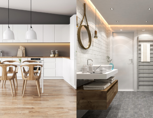
The new kitchen space includes a large kitchen island and Claudine admits she had a moment of panic when the worktop arrived. “It’s absolutely massive – 2.6m long to be precise!” she exclaims. “But it’s brilliant and the amount of storage underneath is incredible. There are cupboards on both sides – while it’s not ideal to have a cupboard in front of the seating, it’s only for those rarely used items and has never been an issue.”

The choice of the reclaimed wooden flooring for the ground floor, which she sourced from a junk yard, was another easy decision for Claudine, who likes things to feel natural and lived in. “Luckily it matches up pretty well with the rest of the house,” she says. “I love the rustic feel it gives, and it also means I’m not precious about dents or scratches because it just adds to their character!”
The master bedroom
Upstairs in the master bedroom, she’s made the most of the available space by going for a classic layout. “Having the chimney means you have the opportunity to maximise this space by adding in built-in joinery on either side, and the size of the room allowed for a super-king bed on the opposite wall,” she says.


As an interior designer, Claudine is all too aware of the problems you face when there’s not quite enough space for everything and finds bathrooms can be particularly tricky. “I’ve worked with clients before where we’ve adjusted layouts upwards of 10 times trying to fit everything in. Sometimes you have to admit defeat and find a way to compromise,” she admits.
In her own bathroom, that meant going without a freestanding bath or walk-in shower. “There was very little chance of making that work,” she says with a rueful smile. “However, the slight L-shape meant we could do a super sweet vanity and mirror set up tucked into the niche. It’s one of my favourite visuals in the whole house!”

What are zellige tiles? Click here to find out how to use them in your kitchen or bathroom
The house, which is full of character and decorated throughout in warm shades, never feels boring or contrived. “I often find myself drawn to earthy colours and textures but manage to find a way to bring a sense of playfulness into it,” says Claudine. “I loved the bold floor tiles for the bathroom but decided to lay them in a way that wasn’t traditional, and it stops the space feeling too put together.”

Today Claudine is delighted with the renovation of her home. “Don’t get me wrong, if I was going through this again I would no doubt change everything, but that’s only because I have so many ideas that I want to try,” she says. “As a designer, I’m always looking for new inspiration and it’s a bit of an addiction sometimes, but this house reflects me and my creative process at that time. It’s a joy to come home to and I feel lucky every time I do!”

Claudine’s words of wisdom
- You don’t have to spend a fortune on things like kitchen handles. I get asked about our ones all the time and they are from Howdens.
- Homes are meant to be lived in. Find a way to embrace the imperfections of a home and lean into them rather than trying to cover them up.
- If it’s possible, try to have wall lights in your bathroom on a separate switch from the main lights/extractor fan. It makes bath time far more relaxing!

As originally told to: Amanda Cochrane | Photography: Adelina Iliev


