Kitchen islands are so delightfully versatile: a place to chop vegetables, have a quick breakfast, or set up your work from home office. The good news is there are many layouts you can choose from, in different sizes and shapes, to make this design statement work in your home.
Whether you have a small space, or a large open-plan kitchen, there’s no doubt a kitchen island is a stylish and practical addition.
So with help from interiors journalist Jill Morgan, we’ve put together a handy guide to help you choose the right kitchen island shape for your home…
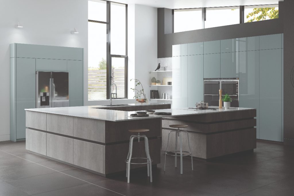
The U-shape kitchen island
Think of a stylish arc of bespoke curved units or regular base cupboards positioned to create three sides of a square or rectangle. When it comes to worksurfaces, they can be gently curving or feature 90 degree corners that echo the units below. This layout makes a dramatic focal point for guests to gather round. It naturally divides the kitchen into zones, from a designated cooking area to an entertaining spot. The U-shape kitchen island works best in large, open place living space.
Pros:
- This is an ideal way to establish a ‘cook-only’ zone
- Useful when entertaining large numbers or in a busy household with young children
Cons:
- A horseshoe style island needs to be a good size to make it worthwhile – in terms of providing storage and seating
- This layout eats up valuable floorspace and you will need 100cm walkways on either side too

Double islands
Go for back-to-back base units, positioned away from the wall, to form an extra deep workspace. It is usually rectangular or square in format, so it provides a separate food prep or work area. It also creates a more sociable setting, with cooking and entertaining taking place at the same time. This design includes both practicality and style as it allows you to add plenty of storage space through deep drawers and pull-out units, while making a bold statement.
Pros:
- This style is extremely multi-functional
- You can include lots of storage space and an appliance or two
- It offers plenty of seats for your family or guests
Cons:
- Double islands are certainly a stand-out feature, however they’re not always a practical solution
- You will have to be able to reach the middle when prepping food, so keep it no deeper than 1400mm front to back

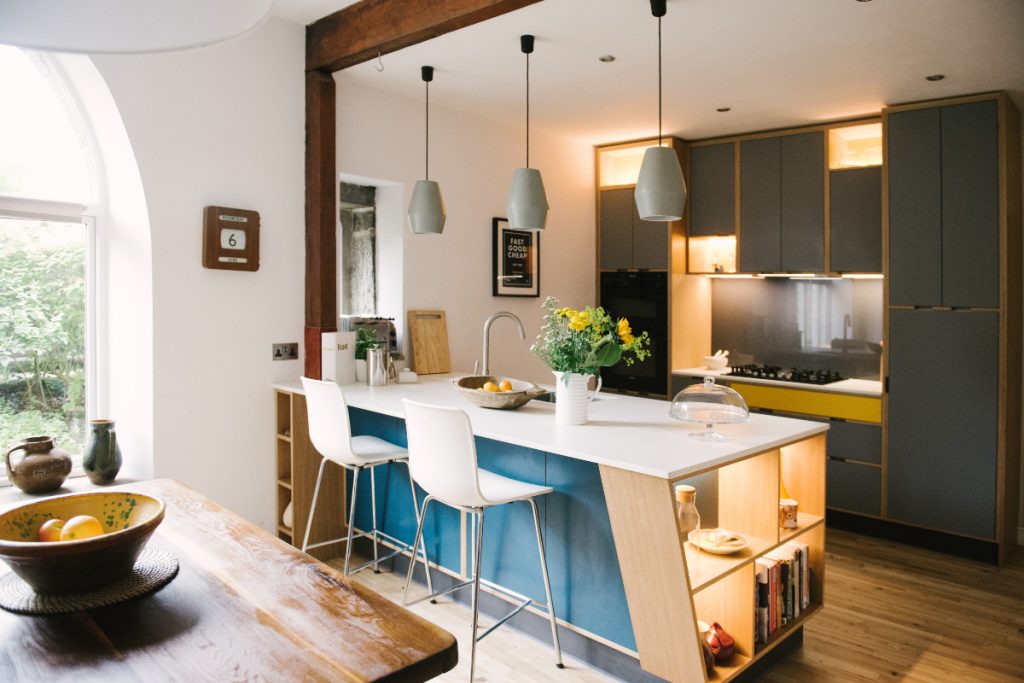
The peninsula island
This layout is formed by a three-sided island that juts out into the central floorspace while sitting flush against one wall. This island style helps you create two distinct areas within one large living area. Add an extra appliance, or indulge in a longed for wine fridge or drawer dishwasher to create a multi-functional design. For a personalised prep or eating area, you can overlay a contrasting material.
Pros:
- Perfect for creating a compact and efficient workspace within an open-plan living space
- It helps establish a safe cook zone, away from small children
- You can vary the length of the peninsula to suit your layout, they don’t have to match the units they run parallel with
Cons:
- Getting the proportions right is key, otherwise the whole space can feel cramped and awkward
- Think carefully before installing a sink as the extra plumbing can prove costly and the surrounding workspace limited
- A fixed arrangement that can be awkward to navigate, particularly as households grow and needs change
- Seating areas tend to be small and only suited to quick bites and drinks

The multi-level island
This layout is perfect if you use your kitchen for multiple purposes. Rather than a casual breakfast bar with high-level stools, this design feature a full-size table at a more accessible height. So you can use it as a home office during the day and a dining spot after you clock out. Or you can make sure you keep an eye on your little ones doing homework while cooking.
Lighting can help switch the mood of the room from practical task lighting to softer, ambient light ideal for entertaining. Plus, choosing the right seating combo is also key. A banquette works great with fitted base cabinets, helping to utilise limited floorspace and create a cosy vibe.
Pros:
- Good for making the most of limited floorspace
- You can have extra workspace and a stylish dining spot
Cons:
- Can visually dominate a small room
- Requires a neat and organised approach to ensure a pleasant dining experience

The dining table
This type of design is more like a traditional setup, used as a preparation area as well as for dining – so materials should be tough. Pair chunky timber worktops and an inset sink and heavy industrial stools for an urban style. Place it in the centre of a kitchen for the functions of an island, but with the added comfort to sit for longer with your family. This option offers plenty of sociable space and is a great option for a family kitchen.
Pros:
- It puts entertaining at the centre of the kitchen
- It’s generous in size
- It makes sure that everyone can dine in comfort and extra guests can be accommodated easily
Cons:
- The sheer scale of the worktop can make reaching the centre tricky
- Appliances need to be quiet and extraction silent yet effective to make eating a pleasant experience

The simple box island
Small and simple, yet very effective, this island can sit parallel or at right angles to the main bank of units. This layout is ideal for gaining extra storage, seating and preparation space. You can add an extra sink or hob to make the most of the layout. Plus, it can help divide cooking and living areas.
Pros:
- This kitchen island shape is perfect for making a style statement and experimenting with a daring material
- Commission a bespoke design or use creative lighting to make a show-stopping feature
Cons:
- Too many different colours and materials can appear messy and make a small room feel cramped so, study your colour palette before making a decision
- Not usually large enough to be multi-purpose or deep-enough to incorporate cupboards or drawers on both sides
- The back of this island can appear flat and uninspiring

How about the look?
Your kitchen island could simply blend into your kitchen design for a sleek scheme. Or you could also use the opportunity and make a design statement with a bright colour, statement tiles, or by adding metallic elements.
Adding a different worktop is also a good trick, as it helps zone your space. And while your at it – and stepping away from the visual side for a bit – why not add some clever power sources, too? After all there’s always some device or phone that needs charging, plus it would make working from home much easier.

So, which kitchen island shape will you go for? Let us know in the comments…


